0207 490 2311
Phone for sales and support

Susanne Helle
A curious minimalist on and off web.
Everyday UX / UXD / UED..

..or whatever you want to call it, whether it's about the experience users have interacting with your company or the visual elements on the page they do it, it all has something in common.
User experience design is the process of enhancing user satisfaction by improving the usability, accessibility, and pleasure provided in the interaction between the user and the product.
- Wikipedia
Let’s be clear about this: Web design always takes the user into account. It’s about making web usable, beautiful too yes, but above all functional and hopefully engaging for the people using it. This should always include seeing how the user will use and feel using the service. ( If you ask me, any design that only focuses in aesthetics is called mediocre art, experimentation or decoration. )
And while you can always slice a piece of cake into smaller and smaller bits, I'd rather not: There’s a whole world behind UX, and we aren’t going there. I’m not even going to remotely mention *ahem* how I think all web designers should have a UX designers’ mentality, even if not using all the tricks of the book..
But I am going to talk about the basic user experience every website should include: Usable, accessible and credible content.
What people want from your website?
Do you know the answer? Whatever it is, make it clear and easy to find.
Try also answering these important questions to show off your value: What do you do? Why to choose you?
HOT TIPS:
- Try writing a tagline / slogan and engaging titles. These are the biggest strings of text on your site. Be eye-catching.
- Social presence! Show where to find you and possibly what people say about you. It’s easy to spread your content everywhere nowadays, and you really should too.
- Engage people emotionally if possible. Be a human and write to humans.
Do people find what they need?
Think about accessibility, ease of use and clarity: Is this intuitive to someone who hasn’t ever seen it before?
HOT TIPS:
- Try asking for feedback from your clients. Set up a simple form with set questions and free text field. You might get surprised!
- Test different things: Wording or call-to-action colours or placement. Let users show you the way.
Can people trust this?
Does it look trustworthy and create the sense of security? Especially important when dealing with online payments, but should be a top priority for any site to seem credible and familiar.
Nobody wants to browse around a dodgy website.
HOT TIPS:
- Encrypt sensitive data. Have a secure connection. Google will actually give a better ranking to sites with HTTPS / SSL, so don’t overlook this!
- Give out a physical location, this is always winner.
- Ditch external advertising, if possible. I understand this is a big deal for some sites, but it lessens your value to have non related, ugly banners around your site. At least make sure to monitor where possible the type of advertising linking from your website so your users can feel safe.
Just remember, you can predict people's rections to a certain limit, some things are just up to everyone's personal taste, location, experience, culture and outlook on life. If you are really interested in your users ( and why shouldn't you be ), that's when the in depth UX comes in, to help you perform to your audience better.
RELATED ARTICLES:
More posts in:

Why creating good written content is like scoring a symphony
Beautiful melodies build up one note at a time. What’s mind-blowing is that this unit, the individual note, means next to nothing on its own.
3 Tips To Help Stay On Top Of Mobile Commerce
It is no surprise that with the changes the advent of the internet has introduced to the world of technology, consumers are also changing in their behavior and expectations from businesses and brands.

Using engaging details to engage your customers
Don’t hold back, you want people to want you.

Breaking down Cyber Security
Our recent project involved a UK Government-backed scheme, Cyber Essentials.
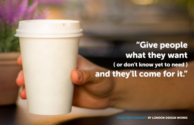
The Importance of Good Structure and Great Content, No Matter What You Sell.
So, you sell disposable paper cups..

Why Message Those Who Abandon Your eCommerce Site?
Cart abandonment is when somebody visits your website and does not complete a purchasing decision.

Why your writing isn’t finished when you think it is
In a digital world built on immediacy, a little patience will transform your writing.

Five Top Mobile Commerce Apps
eCommerce is a growing industry, in particular, the mobile ecommerce industry is rapidly advancing. Consumer behavior has changed, and people are more comfortable with sharing their payment details online.

How long should your blog posts be?
The definitive answer to this much-debated question might not be what you were expecting. Props to you if you already knew.

Two Ways To Retarget Lost Online Customers
Abandoned shopping cart is something that eCommerce experts love to talk about.

People don’t understand your writing. Here’s how to fix it.
Playing a simple game of catch can teach you a lot about getting your message heard.

Could Your Business Benefit From Social Commerce?
Social commerce is using online tools such as social media platforms to interact and build relationships in order to assist sales.

Win over new blog subscribers with a few simple words
There’s something ridiculously easy you can do to build an instant connection with new subscribers.

Now hiring - Business Development and Marketing Manager
Skills needed: Digital agency sales experience and proven success with impeccable attention to detail.

And never start a sentence with a conjunction...
There never has been - and never will be - anything wrong with starting a sentence with and or but. Here’s the skinny.
Ideas for big (and small) companies
Food for thought from booking websites' maps to user rating on ecommerce websites.

The importance of writing with purpose (and how to do it)
Irresistible copy requires you to zero in on a few fundamentals.
1 sentence that will help you stick to your blogging schedule
Keeping your blog updated with prime cuts of content is hard. This little trick may help to rein in your stress levels.

Does Your eCommerce Site Take Too Long To Load?
First impressions are important, and we judge people based on what we see before anything else.

What school didn’t teach you about writing for the web
If you’re dubious that your academic years were the biggest influence on your writing, here’s something to ponder.

Still think content is king? Think again.
When it comes to growing your presence online, the popular message is that quality content rules the roost. Fair enough, right?

New app claims to automatically improve your writing
With the European Commission and Harvard University among its users, Writefull has some pretty heavyweight ambassadors. Just don’t expect it to turn you into Hemingway.

Ways To Increase Traffic To Your eCommerce Site
When it comes to marketing an eCommerce website, increasing website traffic is usually something business people struggle with.

How often should your business be blogging?
It must be one of the most frequently asked questions in the blogosphere: How often should you post?

Ban this word from your business. Right now.
750,000 words capable of being wrought into sentiments that would bring a tear to the eye of Dickens

5 last minute tips for your email marketing this Christmas
Lights festoon the streets. Shoppers wear stroppy faces. Somehow, Christmas is here already. That means it’s time for three things: mince pie scoffing, mulled wine quaffing and making the most of your Christmas email marketing.

Why Mobile Commerce Is Key For Targeting Millennials
Millennials, 18-34 year olds, are not just, typically, known to be early adopters they are a growing population who will shape the future of all industries.
Now hiring - Drupal developer
Skills needed: A love of good coffee, the ability to mix a killer Mojito, the willingness to learn new things and make fun out of WordPress developers!

