0207 490 2311
Phone for sales and support

Susanne Helle
A curious minimalist on and off web.
Pop-ups, please behave!
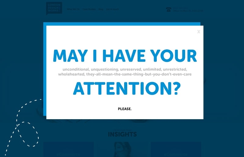
Ah, pop-ups.
As a web designer, it's my job to create these little gems, but as an user I mostly just loathe them. Not because they are unattractive (although, let’s talk about this another time), but because of how they are presented to the user.
Most pop-up ads feel like going into a store and having the clerk jump in your face. Whether they slide from left or roll in from the right, there really isn’t many occasions where I find it appropriate to interrupt my browsing. When something blurs my whole vision, I automatically seek the X on the right top corner. (Clerks usually don’t have this and need actual human interaction. Websites are therefore better.) But alas! If I have to look for the button for too long (or sometimes it doesn’t even exist!), they have lost me. I’ll close the whole page before they can say “We are little sneaky f…”
Ok, I’m not saying I’ve never typed my email address to one, but you need certain smoothness for that to happen. You could be having a 99% off with a free shipping, but if you shove it in my face, I’m likely to step back, or run. There certainly are many statistics about what types of pop-ups are the most effective ones, but if you want my personal and professional opinion, there is a place and time for everything.
For example :
When I just enter the site. I’m curious, just through the door.
Pop-up!
‘Welcome, if you want -25% off anything, subscribe to our mailing list:‘Yes Please!’ / ‘No Thanks, maybe later’”
Ok, that’d be nice.
This is acceptable as long as it has the clear ‘not now’ or ‘close’ option (also called as Panic button).
Or, perhaps I have already been clicking through some items, coming back to some, maybe even dropping few to my basket. Then I stop to think about it.. I’m not active on the page, but staring at it with lazy eyes, mentally calculating if my bank account will endure the blow.
Pop-up!
“Wow, you’ve got great stuff in your shopping cart.. Buy it now and we’ll give YOU a free shipping! Here’s your code: Freemenow”
Oh yeah, sold! And very possibly will come back, you such nice people!
As a special mention, the notable but definitely not total invasions, that appear with a sleek movement from the side or bottom.
Pop-up! ( Or in this case, pop-under. )
“Hello gorgeous, we want to give you 15% your next purchase just for being awesome.. and for signing up for our newsletter ;)”
How seductive.. *giggle* Don’t mind if I do!
Another big turn off is asking to sign up without giving anything back. Right. Now. (Or with next purchase). Needy, I know, but if you ask my email just so you can possibly send me some amazing promotions sometime in the hazy future, I’m probably going to sign up with my secondary email address ialwayswantedtobeanunicorn85 @ howcoolisthat.com, which I might check once a year. And that, to you, is like not having it.
Love it or hate it, we need this ‘limited time only’ feeling with the surprise element to capture our attention.
So, let’s think about pop-ups, they are useful to get the message through. But the way we use them can in some cases make or break the deal.
More posts in:

Why creating good written content is like scoring a symphony
Beautiful melodies build up one note at a time. What’s mind-blowing is that this unit, the individual note, means next to nothing on its own.
3 Tips To Help Stay On Top Of Mobile Commerce
It is no surprise that with the changes the advent of the internet has introduced to the world of technology, consumers are also changing in their behavior and expectations from businesses and brands.

Using engaging details to engage your customers
Don’t hold back, you want people to want you.

Breaking down Cyber Security
Our recent project involved a UK Government-backed scheme, Cyber Essentials.
The Importance of Good Structure and Great Content, No Matter What You Sell.
So, you sell disposable paper cups..

Why Message Those Who Abandon Your eCommerce Site?
Cart abandonment is when somebody visits your website and does not complete a purchasing decision.

Why your writing isn’t finished when you think it is
In a digital world built on immediacy, a little patience will transform your writing.

Five Top Mobile Commerce Apps
eCommerce is a growing industry, in particular, the mobile ecommerce industry is rapidly advancing. Consumer behavior has changed, and people are more comfortable with sharing their payment details online.

How long should your blog posts be?
The definitive answer to this much-debated question might not be what you were expecting. Props to you if you already knew.

Two Ways To Retarget Lost Online Customers
Abandoned shopping cart is something that eCommerce experts love to talk about.

People don’t understand your writing. Here’s how to fix it.
Playing a simple game of catch can teach you a lot about getting your message heard.

Could Your Business Benefit From Social Commerce?
Social commerce is using online tools such as social media platforms to interact and build relationships in order to assist sales.

Win over new blog subscribers with a few simple words
There’s something ridiculously easy you can do to build an instant connection with new subscribers.

Now hiring - Business Development and Marketing Manager
Skills needed: Digital agency sales experience and proven success with impeccable attention to detail.

And never start a sentence with a conjunction...
There never has been - and never will be - anything wrong with starting a sentence with and or but. Here’s the skinny.
Ideas for big (and small) companies
Food for thought from booking websites' maps to user rating on ecommerce websites.

The importance of writing with purpose (and how to do it)
Irresistible copy requires you to zero in on a few fundamentals.
1 sentence that will help you stick to your blogging schedule
Keeping your blog updated with prime cuts of content is hard. This little trick may help to rein in your stress levels.

Does Your eCommerce Site Take Too Long To Load?
First impressions are important, and we judge people based on what we see before anything else.

What school didn’t teach you about writing for the web
If you’re dubious that your academic years were the biggest influence on your writing, here’s something to ponder.

Still think content is king? Think again.
When it comes to growing your presence online, the popular message is that quality content rules the roost. Fair enough, right?

New app claims to automatically improve your writing
With the European Commission and Harvard University among its users, Writefull has some pretty heavyweight ambassadors. Just don’t expect it to turn you into Hemingway.

Ways To Increase Traffic To Your eCommerce Site
When it comes to marketing an eCommerce website, increasing website traffic is usually something business people struggle with.

How often should your business be blogging?
It must be one of the most frequently asked questions in the blogosphere: How often should you post?
Ban this word from your business. Right now.
750,000 words capable of being wrought into sentiments that would bring a tear to the eye of Dickens

5 last minute tips for your email marketing this Christmas
Lights festoon the streets. Shoppers wear stroppy faces. Somehow, Christmas is here already. That means it’s time for three things: mince pie scoffing, mulled wine quaffing and making the most of your Christmas email marketing.

Why Mobile Commerce Is Key For Targeting Millennials
Millennials, 18-34 year olds, are not just, typically, known to be early adopters they are a growing population who will shape the future of all industries.
Now hiring - Drupal developer
Skills needed: A love of good coffee, the ability to mix a killer Mojito, the willingness to learn new things and make fun out of WordPress developers!


